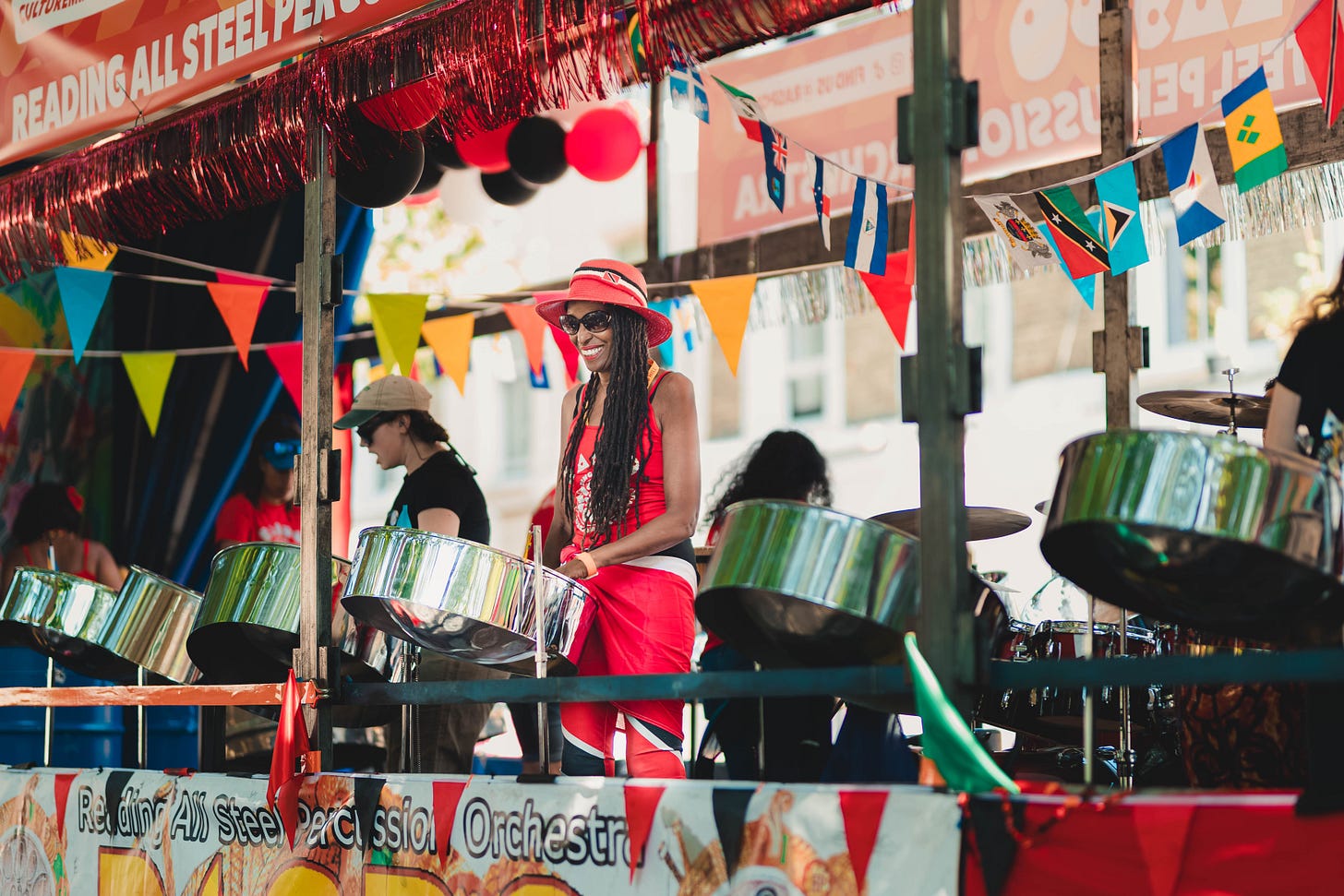
Every August, a relatively small part of West London changes character completely. Streets that usually carry buses, delivery vans and commuters fill with music, food, steel pan, elaborate costumes and crowds moving in almost every direction. Walk a few hundred metres, and the atmosphere can change entirely. One road feels almost calm, another is dominated by a sound system, and around the next corner a procession suddenly occupies everything in front of you.
Notting Hill Carnival is intense by design, but what is perhaps more interesting is that it rarely feels like a collection of unrelated things. Beneath all the colour, sound and movement is a remarkably strong sense of identity. Different bands, performers, traders and communities contribute something distinct, but the experience still belongs unmistakably to the same whole.
This year makes that particularly worth reflecting on. Notting Hill Carnival celebrates its 60th anniversary in 2026, tracing its outdoor beginnings to a children’s street party organised by local resident and social worker Rhaune Laslett in 1966. The neighbourhood had been shaped by racial tension, poor housing and the aftermath of the racist violence of the late 1950s. Laslett wanted to bring people together, including the area’s West Indian community. Steel pan musician Russell Henderson and his fellow players were invited to perform, then began moving through Portobello Road while people followed, danced and joined the procession. Carnival grew from there. Its official history still presents those ideas of community, Caribbean culture and collective expression as central to what it became.
Sixty years later, it has become one of the world’s largest street festivals and one of London’s most recognisable cultural events. City Hall estimates that it contributes close to £400 million to the capital’s economy, while the organisers describe attendance as running into the millions. Its scale also means the apparent spontaneity of the weekend rests on substantial planning. Ahead of this year’s anniversary, City Hall committed an additional £4.66 million following an independent safety review, with funding going towards crowd management, stewarding, barriers and security infrastructure.
There is something surprisingly relevant in all of this for anyone building digital products.
Carnival manages to contain extraordinary variety without losing its identity. It gives people freedom while still providing structure. Different contributors can express themselves without making the overall experience incoherent. People navigate through a complicated environment using cues, landmarks and familiarity rather than following one perfectly controlled route.
Digital product design is wrestling with many of the same tensions, particularly now.
Over the last decade, we have become extremely good at making software clean, consistent and familiar. Design systems have helped. Shared interaction patterns have helped. Accessibility standards have improved. More recently, AI has accelerated the process again. Product teams can now move from a rough idea to something that looks and behaves surprisingly polished in a fraction of the time it once took. Figma Make, for example, can generate interactive prototypes from natural language, incorporate real design systems and components, and connect prototypes to data or a backend.
That is enormously useful.
It also creates an interesting problem.
If competent interfaces become easier to make, what makes a product worth remembering?
Perhaps the next stage of good product design is not about stripping even more away. Perhaps it is about rediscovering how clarity and personality can coexist.
When simplicity starts to become sameness
There is now a recognisable visual language across a large part of the digital world. Pale backgrounds, carefully rounded cards, restrained typography, generous spacing, muted gradients and, increasingly, a little sparkle somewhere near whichever capability contains AI.
There is nothing inherently wrong with any of it.
These conventions became common partly because familiarity is useful. People should not have to decipher an entirely new interaction language every time they download an app or open a website. When controls behave consistently, users can spend their attention on the thing they actually came to do. The problem appears when simplicity stops solving a user problem and becomes an aesthetic default.
Walk through Carnival and the opposite seems to be happening. There is no shortage of things competing for attention. Costumes can be enormous. Colours collide. Sound systems overlap. Food stalls, performers, flags, shopfronts and thousands of people occupy the same space. Yet the result is not simply an undifferentiated wall of noise.
There is hierarchy within the abundance.
A masquerade band moving down the street demands a different kind of attention from a temporary directional sign. A towering costume separates itself naturally from the crowd. A steward needs to be visible for reasons that have nothing to do with spectacle. Music can tell you something about what lies ahead before you can see it. The useful lesson is not that digital products need to become brighter or more decorative. It is that clarity does not require everything to be quiet.
A complicated dashboard can still feel straightforward when the hierarchy is obvious. A marketplace can contain thousands of products without feeling overwhelming if people understand how to narrow the field. An enterprise system can contain considerable depth while keeping the next useful action clear.
Likewise, an interface with only six things on it can still be confusing if all six are competing for equal importance. Good simplicity is not emptiness. It is prioritisation.
That distinction is easy to lose when we optimise endlessly for reduction.
Good products give people somewhere to orient themselves
Anyone who has tried to navigate Notting Hill during Carnival knows that the ordinary geography of the area behaves a little differently for the weekend. Roads close, crowds redirect movement, and a journey that would normally take five minutes can become something much more improvised.
People adapt quickly.
You start to navigate through landmarks. You remember the station you arrived from, the road where a particular sound system was playing, the junction where you stopped for food, or the stage you passed twenty minutes earlier. Those points give shape to what might otherwise feel like an overwhelming environment.
We do something similar inside software.
People rarely hold a complete map of a digital product in their heads. Instead, they develop an approximate understanding of where things live and how the system behaves. A particular area becomes the home of a recurring task. A familiar navigation element becomes the way back. A dashboard becomes the starting point for everything else.
Problems appear when products make that mental map difficult to form.
A settings section moves between releases. Similar functions live in different places. Reports, editable workspaces and approval screens look almost identical. Navigation reflects internal organisational language rather than the way customers think about their work. Each screen might be individually understandable, but the product as a whole feels difficult to inhabit.
Good products give people landmarks.
Important parts of the experience have recognisable identities. Navigation remains predictable. Similar actions behave in similar ways. When users take a wrong turn, they can work out where they are and how to recover. This is why consistency matters, but it is also why consistency should not be confused with visual sameness.
Imagine trying to navigate London if every building, road and public space looked exactly alike. Uniformity would make the city harder to understand, not easier. A digital product faces the same problem.
A checkout should feel different from discovery. A high-consequence approval should not have the same visual weight as an informational message. A workspace somebody visits every morning should become recognisable enough that it feels familiar before they have consciously processed what is on the screen.
Consistency tells people how a product behaves. Difference helps tell them where they are.
Consistency should create freedom, not uniformity
Carnival itself is a particularly good example of a shared identity that does not rely on everything matching. Different sound systems have distinct personalities and audiences. Steel bands bring their own musical traditions. Masquerade bands interpret costume in very different ways. Food, music and performance reflect multiple communities and influences.
Nobody appears to have designed the entire event from a single component library.
And yet, it is unmistakably Carnival.
There is a common cultural identity underneath the variation. That is a useful way to think about design systems. As products grow, creating a shared system is sensible. Teams should not repeatedly invent buttons, forms and menus from scratch. Interactions should not change arbitrarily depending on which part of the organisation happened to build them. Accessibility should not be optional.
But mature design systems should provide grammar, not a stencil.
Grammar gives language enough structure to remain understandable without making every sentence sound the same. A design system should do something similar. It should establish how a product communicates and behaves while leaving enough room for different parts of the experience to express their purpose.
That becomes more important as AI enters the design process.
Figma already lets teams provide existing components, libraries, and design rules as context for generated prototypes. The result is that consistency can be built into the output from the beginning rather than recreated manually afterwards. That should free teams from a great deal of repetitive work.
The interesting question is what they do with that freedom.
If every product begins from the same conventions and then AI automatically keeps every screen perfectly aligned to them, consistency becomes almost effortless. The differentiating work moves elsewhere. Towards judgement, expression, hierarchy, interaction and understanding when a moment deserves to feel different.
The design system should make creativity safer. It should not remove the need for it.
When AI makes competent design easier
AI is changing the economics of early product development more quickly than many organisations have fully absorbed. A rough idea can now become something interactive before a traditional specification would once have been finished. A product manager can explore a concept without first assembling a full development team. Designers can move through several alternatives quickly, then spend more time refining the strongest direction. Engineers can work from something more tangible much earlier.
Figma Make is one visible example. It can generate screens, logic, navigation and real interactions from a prompt, incorporate existing assets and systems, and allow teams to move between generated code and visual editing. This is a meaningful change in how products can be explored. What it does not do is make product judgement obsolete.
There is an important difference between making something look finished and actually finishing it. Figma itself makes this point in its guidance around AI-generated prototypes. A first draft can look convincing while using the wrong components, generic copy and none of the edge cases that become important once real customers interact with it.
AI can generate an onboarding flow. It does not automatically know why customers abandon yours.
It can create a dashboard. It doesn't know which decision the dashboard needs to improve unless someone has understood the underlying problem first.
It can generate a convincing marketplace in an afternoon, but the difficult part of running a marketplace usually sits much deeper than the interface. Search relevance, availability, fulfilment, pricing, merchant behaviour, trust and all the odd situations produced by real users have to work too.
The surface is becoming cheaper.
Understanding remains expensive.
That has implications well beyond design.
We have written previously about data teams becoming extremely effective at producing dashboards while organisations did not necessarily become equally effective at making decisions. When output becomes easier, it is tempting to produce more output.
AI could create exactly the same dynamic in product.
More screens, more prototypes and more features are not automatically signs of progress. The ability to make something quickly does not tell us whether the thing deserves to exist. If anything, restraint becomes more important as production becomes easier.
Why journeys matter more than individual screens
Another thing Carnival makes obvious is that experiences unfold over time. You do not stand in one place and consume the entire event from there. You move through it. One road might feel relatively quiet, then music gradually becomes louder as you approach another. A crowd appears. A procession passes. Further on there is food, conversation and space again. The transition between those moments changes how each one feels.
Digital products work in much the same way, but product teams often review them as a collection of individual screens. The login page looks good. The dashboard looks good. The payment screen looks good. The confirmation looks good.
The customer experiences something different.
They enter the same information twice because two systems don't talk to one another. They press a button and wonder whether anything happened. They experience a login prompt halfway through a process. They leave one application, find something elsewhere, copy it back, and try to remember where they were.
A beautiful screen does not compensate for a broken journey. This is especially relevant when AI is added to existing products. There is a rush to introduce conversational interfaces because they are visible signs that a product has become more intelligent. Some genuinely improve the experience. Others simply add a box beside the work.
The user opens it, explains the context the system should already understand, waits for an answer, copies the response into another part of the product, and continues the original task.
That is not necessarily a better journey.
It is another interface.
A more useful product question is where the experience currently loses momentum.
Where does somebody repeat work? Where do they have to search for something the system could already know? Where is information provided without making the next decision any easier? Where are customers abandoning a process because the organisation has divided one journey across several systems?
Sometimes AI will be the right answer. Sometimes automation will be. Sometimes better integration removes the problem entirely. Occasionally the answer is much less glamorous - a clearer message, a better default, or one unnecessary step removed.
The technology should follow the experience, not the other way around.
The people using a product become part of the product
Carnival also works because the people attending it are not merely passive consumers of somebody else’s finished experience.
Participation changes it.
Its history makes that particularly important. The outdoor event that emerged in 1966 was rooted in an attempt to bring together a divided neighbourhood. Caribbean residents, steel pan musicians, and the communities around Notting Hill did not simply attend something created for them. Their participation shaped what the event became. That community-led identity remains central to how Carnival describes itself today.
Digital products accumulate behaviour in much the same way.
A marketplace changes according to its buyers and sellers. Collaboration software develops conventions that were never written into a product specification. Teams invent shortcuts. CRM fields acquire meanings that the original designer never imagined. A feature that looked unimportant at launch can become essential because customers find an entirely different use for it.
This is why building with users is different from simply asking them what features they would like. People are often very good at revealing a problem and much less good at specifying the right solution.
Watching somebody work can expose a workaround they have stopped noticing. It can show that an apparently trivial step is frustrating because it happens fifty times a week. It can reveal that terminology everyone inside a business understands perfectly is confusing to everybody outside it.
We have seen this ourselves while developing Emily.
Some of the most useful changes have not come from neat feature requests. They have come from understanding where a real interaction became awkward. When did somebody expect Emily to act without asking? When did they want confirmation first? Which pieces of context did they assume an assistant should already remember? When did an apparently simple email request turn into a task involving several people, calendars and decisions?
The feature is only the visible part.
The behaviour around it is where the product really lives.
This becomes particularly important as AI makes products more adaptive. If software can respond differently depending on context, then understanding the people providing that context becomes even more valuable.
Personalisation without understanding is simply variation.
Freedom works best when the boundaries are clear
There is a danger in taking the Carnival analogy too far and imagining that its apparent spontaneity somehow happens without structure. It does not.
An event operating through residential streets at this scale requires significant coordination, stewarding, transport planning, safety infrastructure and crowd management. The 2026 anniversary is a particularly visible reminder of that. Following an independent review, City Hall committed an additional £4.66 million this year to support measures including increased barriers, stewarding, security capacity and strengthened crowd management arrangements.
The freedom experienced by the person attending the event is partly possible because boundaries and systems exist underneath it. That is an important product lesson. Constraints are often described as obstacles to creativity, but the right constraints are what make creativity usable.
A design system is a constraint. An accessibility standard is a constraint. A rule preventing an AI system from sending sensitive information without approval is a constraint. A clearly defined permission model is a constraint.
None of these things exist to make the product less imaginative. They create a reliable environment within which the product can do more. This will become increasingly important as software becomes more adaptive.
Traditional applications are comparatively deterministic. A button is programmed to perform a particular action. More agentic products are different. They may interpret context, choose between several possible actions, and behave differently depending on what they think the user is trying to accomplish.
That can make software feel much more natural. It also makes the product's boundaries more important.
When should the system act by itself? When should it ask? What happens when confidence is low? Can the action be reversed? How visible should the reasoning behind an action be? Which information can be used automatically, and which needs explicit permission? Good product design is increasingly about deciding where flexibility is valuable and where predictability matters more.
You might want an assistant to change the wording of an email depending on whether it is being sent to a colleague or a new client. You probably do not want it taking the same creative approach to a payment amount. One benefits from interpretation. The other needs a boundary.
Why delight still deserves a place in product design
Another lesson from Carnival is easy to dismiss because itis hard to represent on a product roadmap. People like things because of how they make them feel. That sounds obvious until product conversations become dominated by completion rates, conversion funnels, efficiency and retention.
Those measures matter. A product that does not work cannot be rescued by personality. If someone cannot complete a payment or understand a critical piece of information, decorative delight is not the solution.
But utility is not the whole experience either.
We make choices based partly on feeling everywhere else in life. Atmosphere affects which restaurants we return to. Packaging changes how a physical product feels before we have even used it. We remember spaces, objects and brands that have character.
Software is not somehow exempt from that.
Part of the challenge is that functional improvement is easier to quantify. Removing two steps from an onboarding process can be measured. Making an interaction feel considered, reassuring or unexpectedly enjoyable is harder to place on a spreadsheet.
That does not make it irrelevant.
The digital industry had good reasons for moving away from unnecessary visual excess. Decoration that interferes with basic tasks deserves to disappear. Animation, because somebody discovered animation is not automatically good design.
But there is a meaningful difference between removing distraction and removing identity.
Carnival without its costumes, music, steel pan, sound systems and visual expression could still technically occupy the streets of West London. It simply would not be Carnival. Digital products deserve a similar question. Once the functional problem has been solved, what makes the experience recognisably ours?
As products become easier to create, humanity becomes more valuable
There is an interesting contradiction emerging in product development. We have never had better tools for creating and testing ideas. Product managers can turn rough concepts into interactive prototypes. Designers can explore more directions in less time. Engineers can move between generated code and design much more fluidly. Existing components and brand systems can become context for AI rather than something that has to be reconstructed each time.
In theory, that should unlock an enormous amount of creativity. It probably will. It could also create a great deal of sameness.
Generative systems are exceptionally good at recognising patterns. Ask for a modern software dashboard, and the result is likely to contain many of the things modern software dashboards already contain. That is useful. Starting from a competent convention is often much better than beginning with a blank page.
The danger comes when the starting point is mistaken for the finished product. As functional competence becomes easier to generate, judgement becomes more valuable.
That means knowing when a familiar pattern genuinely helps a customer and when it merely makes the product look like everything else. It means understanding that visual hierarchy is not synonymous with removing colour. It means allowing a design system to support identity rather than slowly erase it. It means looking at the complete journey instead of celebrating a collection of polished screens.
More importantly, it means remembering who the product is for.
People bring expectations, habits, memories, frustrations and culture into an experience. They notice when something feels considered even if they could never describe which design decision created that feeling. They form attachments to products that understand them, and quickly lose patience with ones that constantly demand they understand the software instead.
That is why Carnival feels like such an interesting place to look for product lessons.
Not because a digital interface should imitate feathers, soca, steel pan or the sensory intensity of Notting Hill on an August Bank Holiday. That would reduce an important cultural event to a visual metaphor and miss almost everything interesting about it.
The lesson sits deeper.
Carnival has endured because it combines identity with evolution. It allows distinct communities and forms of expression to coexist within something recognisable. People participate rather than simply observe. Its apparent freedom depends on structure, and that structure has had to evolve as the event itself has grown.
Great products face many of the same tensions.
They need clarity, but not sterility. Consistency, but not uniformity. Flexibility, but not unpredictability. Enough structure for people to understand how things work and enough personality for them to care.
At White Rabbit Foundry, we spend a lot of time thinking about removing friction from digital experiences, whether that involves products, data, automation or AI. That remains important. Nobody wants a beautifully expressive checkout that they cannot actually complete.
But perhaps frictionless has become too closely associated with characterless.
As AI makes competent digital experiences faster and cheaper to produce, some parts of product development that are hardest to automate may become more important, not less.
Taste. Judgement. Curiosity. Cultural understanding. Empathy. Knowing what to simplify and what to preserve. Knowing when an experience should quietly disappear into the background, and when it deserves to command the whole street.
The future of product will almost certainly contain more AI.
The products we remember may be the ones that still feel unmistakably human.